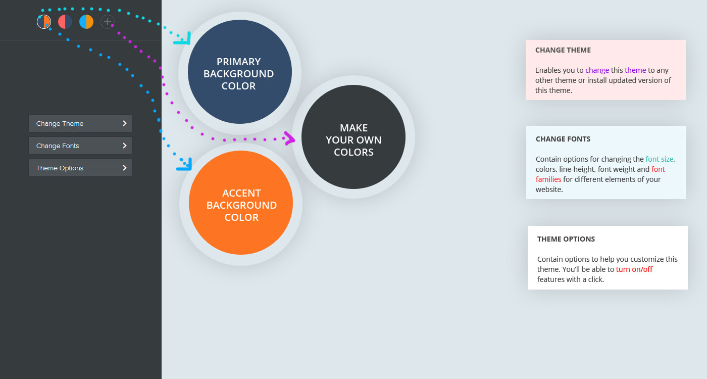
Color Options
There are 3 predefined colors, the 4 option (with plus sign) is for you to set your preferred colors.
|
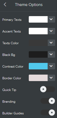
Primary Texts:
Sets the texts color that appears on sections with Primary Background color. If the Primary Background Color is dark, the Primary Texts should be set to white or any other lightter color for visibility. Accent Texts: Sets the texts color that appears on sections with Accent Background color. If the Accent Background Color is dark, then Accent Texts should be set to white or any other lightter color for visibility. Texts Color: Sets the text color of the paragraph "Text" element. Use this color option instead of weebly default option for styling the text element. Black Bg: Sets the color of black background colors used across the theme. In this theme demo dark blue color is used for black but you can set it yo your preferred black color. Contrast Color: Sets link color and links hover color. Contrast color should always be set to a dark color such as blue, red, orange, etc. for visibility. Border Color: Sets a grey line (border) color of elements. Quick Tip: Add/Removes the welcome screen and message on how to get started. Branding: Add/Remove the "Powered by Roomy Themes" branding in the footer. Builder Guides: Add/Remove guides from the website editor. The "Builder Guides" indicate content sections such as where to edit and where to drop elements. |
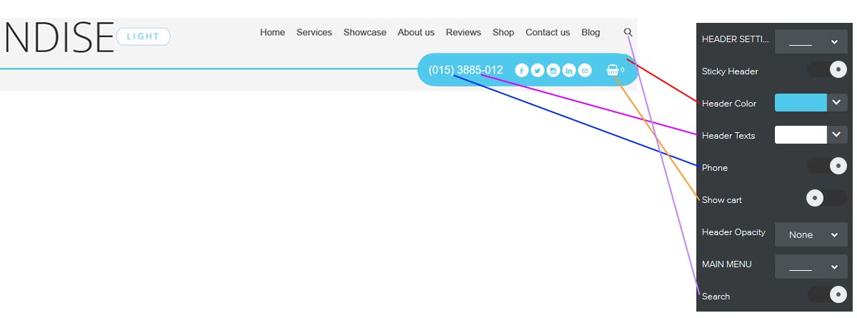
Header Options
|
Sticky Header:
Fixes the header to the top when scrolling down the page. Header Color & Header Texts: Sets background color of the bottom header box (the cylinder box) that contains phone number, social icons and cart. It also colors the line runs across. Header Texts: Sets the text color of phone number and cart. |
|
Phone:
Hide/show phone number in the header. Header Opacity: Puts a transparent layer over the header image. Option to set layer transparency to: 30%, 50%, 60%, 70%, 80% or none (no transparent layer). Search: Hide/show search trigger in the header. |
|
|
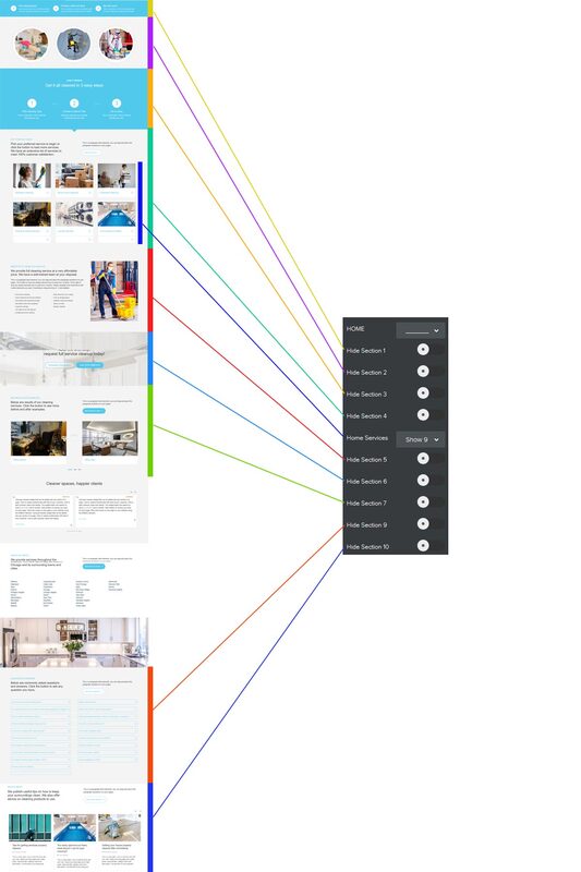
Home Options
Hide Sections 1, 2, 3, 4, 5, 6, 7, 9 and 10.
Removes above listed custom content sections within the homepage. Home Services: Sets number of services to show on the homepage to 3, 6 or 9. |
|
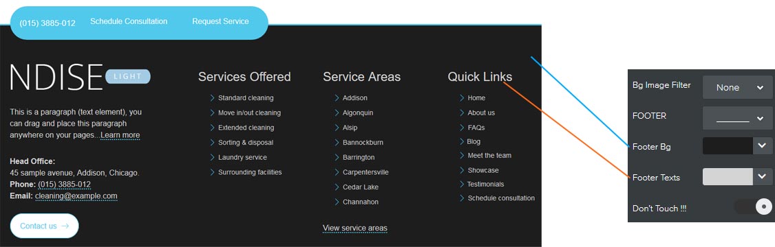
Footer options
Bg Image Filter: Puts a transparent layer over the section background images. Option to set layer transparency to: 30%, 50%, 60%, 70%, 80% or none (no transparent layer).
Footer Bg: Sets the background color of the footer.
Footer Texts: Sets the texts color of the footer.
Footer Bg: Sets the background color of the footer.
Footer Texts: Sets the texts color of the footer.
